Teanage
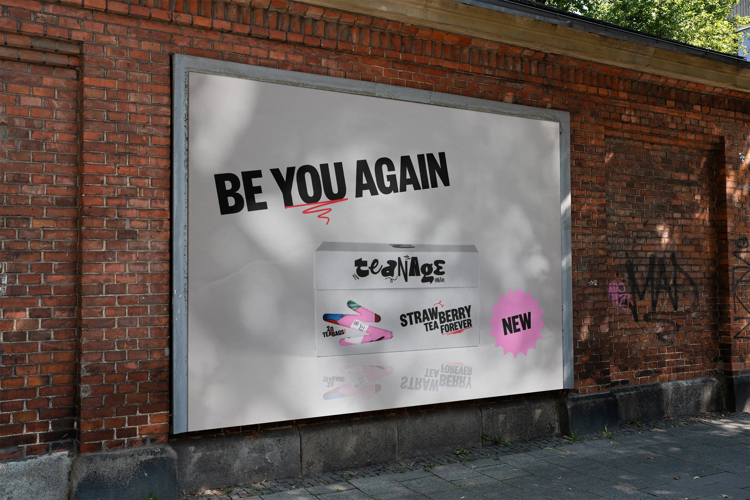
Teanage is for the generation that still feels like a teenager even though they are older than their parents were when they bought their first home. It is for those who remember what it was like growing up and now spend time reconnecting with the person they once were.
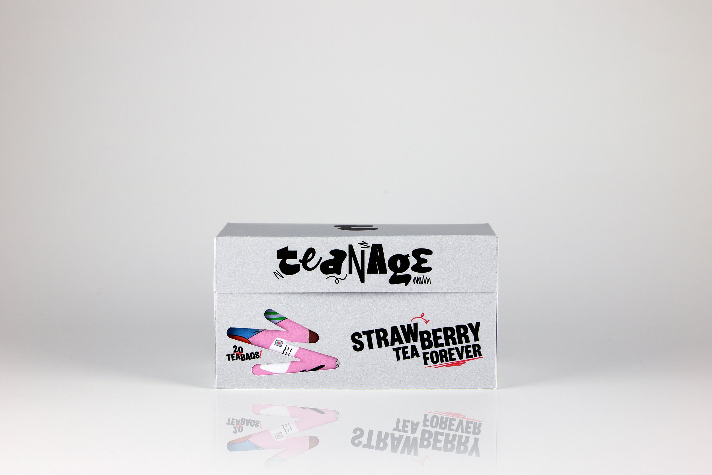
For this packaging I wanted to experiment with the contrast between a grey outside together with a colorful inside. By using a cutout in shapes from the logo on both sides of the packaging I created a subtle, yet playful way of creating a curiousness for the product. The brand has influences from punk typography, combined with colorful illustrations that depict a story.
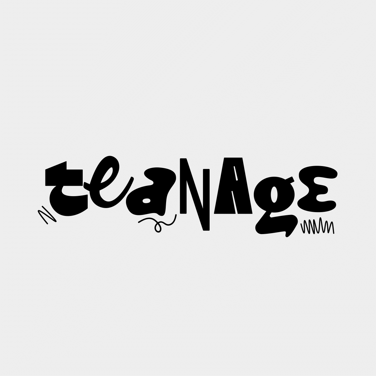
I custom-made the logotype lettering, drawing each letter individually to create contrast with the surrounding letters.
Teanage speaks directly to the audience in a personal way that creates a sense of belonging. By doing so, Teanage develops a relationship with the audience that can be built upon and used in marketing, social media and merchandise, so that the brand can be more than just tea.
Client
Conceptual Project
Tags
Visual Identity, Packaging Design, Packaging Construction, Illustration, Final Art, Animation, Marketing Material